This is the third post in the Strategic colouring in Power BI series. Links to all the posts can be found here
https://capstoneanalytics.com.au/master-post-for-strategic-colouring-articles/
In the previous post we saw how to compare a trend of one or multiple category in a field versus the rest of the categories.
In this part we will see how to isolate a category in a trend
For this we need two measures and one new table
Define a new table as folllows
ProductSize =
VALUES ( dimProduct[Size] )
Define the two measures as follows
TotalSalesAmount =
SUM ( fctSales[SalesAmount] )
TotalSalesAmountSelectedSize =
IF (
ISFILTERED ( ProductSize[Size] ),
CALCULATE (
[TotalSalesAmount],
TREATAS ( VALUES ( ProductSize[Size] ), dimProduct[Size] )
),
BLANK ()
)
Now we are ready to visualise
In a line chart Drag Monthname into Axis and [TotalSalesAmount] into Values and dimProduct[Size] into Legend. Make the colours of all the lines grey and under Format-> Y axis change start to 0 and End to 500000. This way we are defining the start and end points and they do not change
Copy the visual. Remove the legend and Values and drag [TotalSalesAmountSelectedSize] into Values. Make the colour a bit brighter like green or blue.
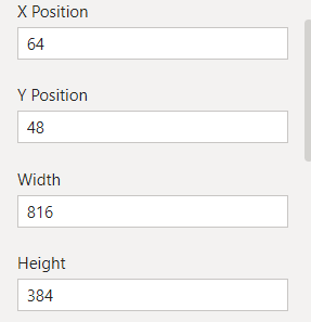
Now here is the hack to make it work. Click on the first visual and under Format-> General, note the values. They will be something like this

Now select the second visuals and copy – paste the values from above into the Format-> General section. Now both the visuals are on top of the other. You have to make sure that the second visual is in front and the first one is at the back. You can use the Format – Bring forward/Bring backward to achieve this.
Next drag the ProductSize[Size] into a slicer visual and make it single select. Happy interrogating !
