This is the seventh post in the Strategic colouring in Power BI series. Links to all the posts can be found here
https://capstoneanalytics.com.au/master-post-for-strategic-colouring-articles/
In the sixth post, we discussed how to isolate and visualise YTD data
In this post we will discuss how to dynamically calculate the yearly percentage sales of top N products and measure it against a target % value. The technique used is different than the one used in the previous post. In the previous post we plotted sales of top 10 products by filtering the visuals to give the top 10 sales. This gave us the sales of the global top 10 products for each year. However what we want is the sales of top 10 products for each year and plot it accordingly.
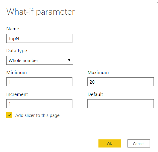
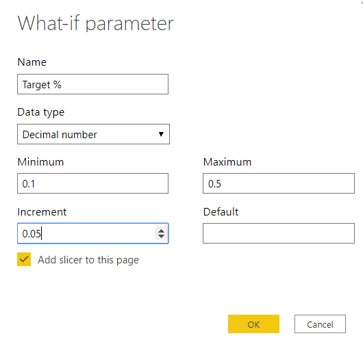
We will use the same data model as the previous post. Since we will be dynamically plotting the sales, we need to calculate two parameters, one for top N and the other for target %. Our topN parameter and target % parameter will be defined like this. Make sure the ‘Add slicer to this page’ option is selected.


Next we will calculate the Top N sales measure incorporating the TopN value measure defined in previous step
TopN Sales =
VAR top10sales =
ADDCOLUMNS (
GENERATE (
VALUES ( ‘Date'[Year] ),
TOPN ( [TopN Value], VALUES ( Products[ProductID.Product] ), [Total Sales] )
),
“TotalSalesTop10”, [Total Sales]
)
RETURN
SUMX ( top10sales, [TotalSalesTop10] )
The topN sales % is calculated as
Top 10 Sales % =
DIVIDE ( [TopN Sales], [Total Sales] )
In order to achieve strategic colouring we need to define three measures and compare the TopN sales % against the target measure
TopN Sales % Above Target =
IF ( [TopN Sales %] >= [Target % Value], [TopN Sales %], 0 )
TopN Sales % Below Target =
IF ( [TopN Sales %] < [Target % Value], [TopN Sales %], 0 )
Total Sales Remaining % =
1 – [TopN Sales % Above Target] – [TopN Sales % Below Target]
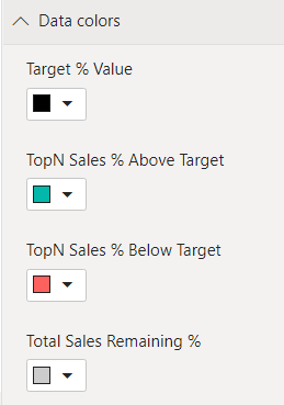
Now we are ready to plot. Create a line and stacked column chart and drag Year into Axis and drag the above three measures into Column values and drag Target % value into Line values. Under Data colours section of the chart give the following colours to the measures

You can interact with the chart by changing the TopN and Target % sliders and see the effect on the charts
