
When we are visualising month on month trends for a single year the normal way to represent it is to show the months in the X axis and the data you want to visualise (say sales) in the Y axis. It would look something like this. Here we are plotting Total Sales versus Month where
Total Sales =
SUM ( ‘Sales'[SalesAmount] )
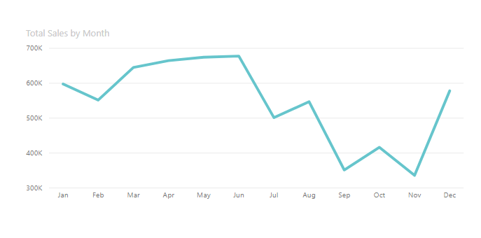
This works perfectly fine as we can see the trend clearly going down. But what if we want to show it differently. How would we achieve it. What if we want to show the percentage change compared to a benchmark month. In this example lets pick January as our benchmark month and we want to see the % change of other months from January. For this we will define a new measure called.
Sales in January =
VAR alljan =
CALCULATE (
[TotalSalesAmount],
ALLEXCEPT ( ‘Calendar’, ‘Calendar'[CalendarYear] ),
‘Calendar'[MonthName] = “January”
)
RETURN
alljan
We then define the measure which needs to be plotted as
% sales compared to January =
[Total Sales] / [Sales in January]
We then replace the Total Sales measure in the above chart and replace it with %sales compared to January measure. The chart now looks like this
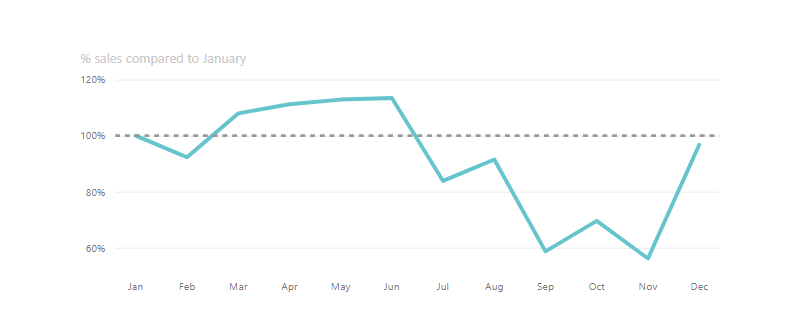
The trend is the same as the first chart except that January is now the benchmark and hence is at 100%. The remaining data points show the sales as a percentage of January’s sales.We can see that September and November were the worst months as their sales were less than 60% of January’s sales.
Can we show it in another way. What if we want to show the data point for each month as a percentage change from previous month. Hence we are not interested in the absolute values but only the percentage increase or decrease from previous month. For this we need to define just one measure which goes like this
% sales compared to previous month =
VAR prvmonthsales =
CALCULATE ( [Total Sales], PREVIOUSMONTH ( ‘Calendar'[DateID] ) )
RETURN
( [Total Sales] – prvmonthsales ) / prvmonthsales
We now plot this and the chart looks like this
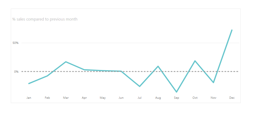
This chart is different from the first two. Now we see that even though June had the highest sales it was in fact December which had the highest percentage increase from the previous month. Such insights would not have been possible with the normal way of trending.