
This post is inspired by a blog in which the author showcased the visualisation of % top city sales for a region in Tableau. I thought the solution provided was cumbersome so decided to visualise it in Power BI. It turns out that the DAX for this is straightforward but the visualisation was tricky as I had to use two visuals to convey all the information. In this blog I will show how to do it.
The data model has two tables, Orders and Region. Each region has many cities within it, The problem statement is to determine the city with the top sales % and visualise it. So lets start with the DAX first. The first measure to be defined is SalesAmount
SalesAmount = SUM ( Orders[Sales] )
Next we define a measure which calculates the sales of the top city for each region. For this, firstly we will define a measure which will calculate the city with the most sales
Top City =
TOPN ( 1, VALUES ( Region[City] ), [SalesAmount] )
Top City Sales is defined as
Top City Sales =
VAR topcity = [Top City]
VAR result =
SUMX ( FILTER ( Region, Region[City] = topcity ), [SalesAmount] )
RETURN
result
Next we define the Top City Sales %
Top City Sales % =
DIVIDE ( [Top City Sales], [SalesAmount], 0 )
Finally we define a measure which gives the difference between SalesAmout and TopCitySales
Sales Amount Diff = [SalesAmount] – [Top City Sales]
Next we visualise it. Drag the 100% Stacked Bar chart visual into an open canvas and drag Country into Axis and Top City Sales and Sales Amount Diff under Values. Formatting Top City Sales as Blue and Sales Amount Diff as grey and turning on Data Labels for Top City Sales, we get the following visual
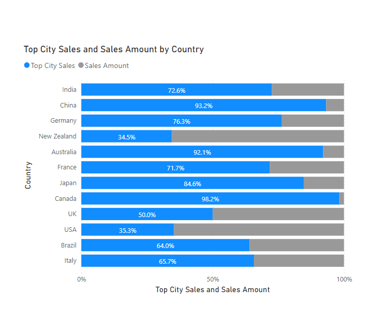
Since India has the largest Sales it is shown as first and China is second and so on. You can also see that the Top City Sales for India is 72.6% and the country with the highest sales of its top city is Canada at 98.2%. But Canada has lower sales hence its not at the top of the chart. What we want is to sort this visual by the top city sales % measure so that the chart will be ordered in descending order of top city sales %. For this to be achieved, we drag Top City Sales % measure under Tooltips. We also drag the measure Top City under Tooltips. Using the three dots at the top right corner of the chart we sort the Axis in descending order by Top City Sales % and we get this chart
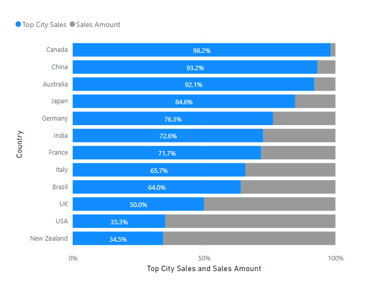
This is already looking good. Canada is now on top and New Zealand is at the bottom. But by just looking at this visual we do not get any information on which are the top cities for each region nor do we get any information on Sales Amount for the region and the cities. in order to achieve this we drag a Table visual into the same canvas and drag Country, SalesAmount, Top City, Top City Sales, and Top City Sales % under Values. We then conditionally format Sales Amount and Top City Sales (Under Values right Click on each of those measures and select Conditional formatting -> Data bars and choose the required colours). We then place the Table visual beside the 100% stacked bar chart and ensure that the rows are aligned. It should look like this
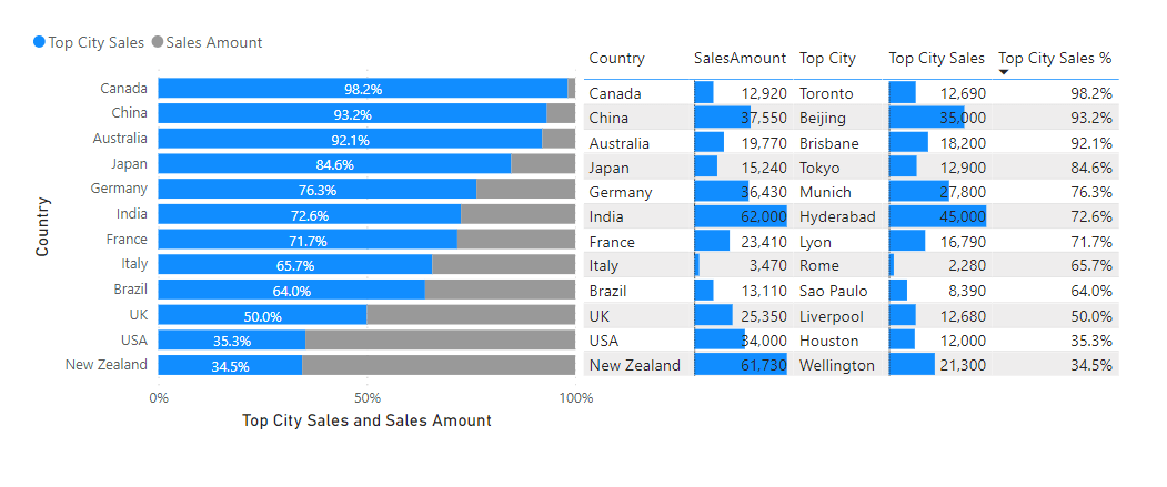
We now get the complete picture of the cities with the highest sales for each region and also their Sales Amount and % of the total sales